Web Project
Redesigning Mycustompackaging Packaging Design — UI/UX Case Study

Web Project


I was one of the initial UI/UX designers to join Viveprinting and help the company grow to a massive scale in a span of 1.5 years while I'm there. I’ve worked on a lot of projects and a wide variety of projects. A few small ones, a few big ones, and a few massive ones. In this case study, I am going to talk about one of my massive projects which also happens to be one of my favorite ones.
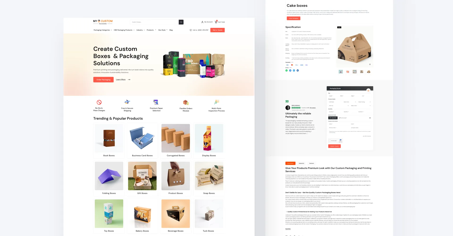
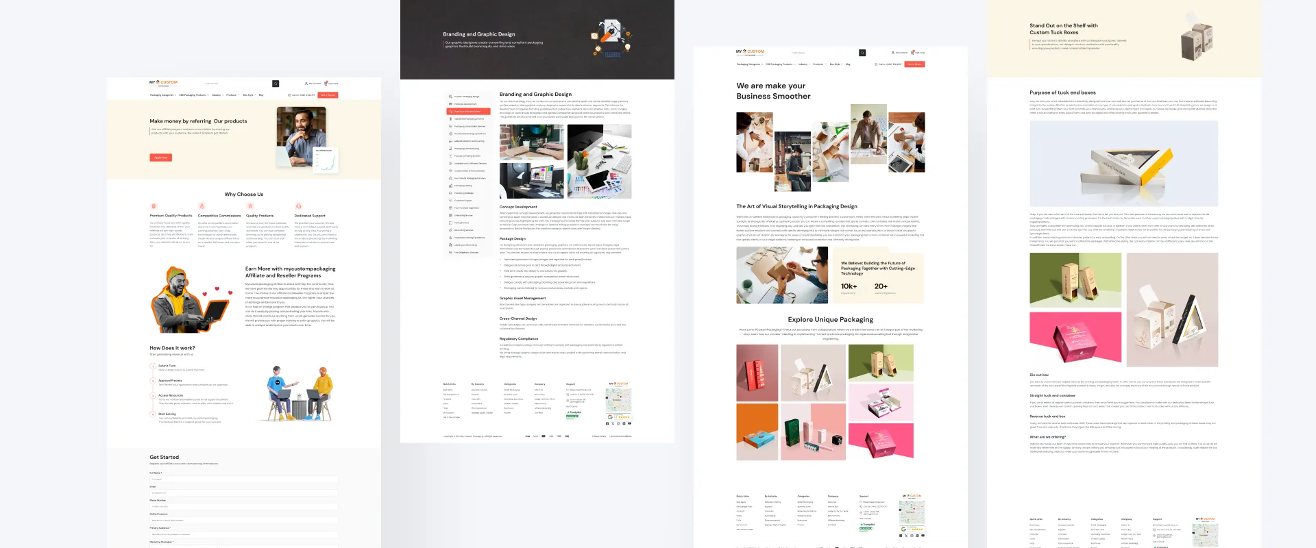
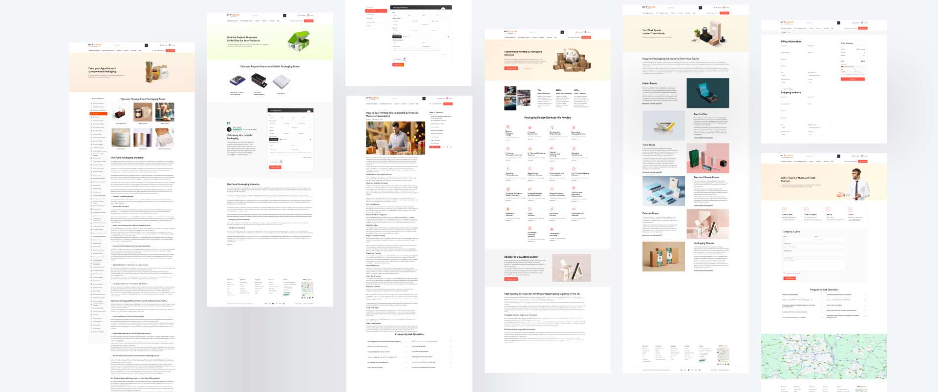
Viveprinting is a leading UK-based packaging solutions provider. Their website offers a wide range of custom packaging design, printing and fulfillment services. It allows users to browse product samples, learn about their industries expertise, and view real client projects.


Define

Research

Analysis

Wireframe

Design
When I first looked at the Mycustompackaging website, there were several problems that made it hard for customers
to use. The way information was organized did not make sense, so people had trouble finding what they
wanted.
Pages also took too long to load, which likely caused some users to leave without finishing what they wanted
to do. Additionally, different sections of the site worked inconsistently, causing confusion.
The overall appearance of the site seemed outdated. It did not clearly showcase all the printing and
packaging
Primary Research:
The primary research for the Mycustompackaging project involved a comprehensive analysis of the printing industry landscape, focusing on market trends, customer preferences, and competitors' strategies. This included gathering data from industry reports, market studies, and competitor analysis tools.In-Person Interviews:
In addition to online research, in-person interviews were conducted with key stakeholders within the printing industry, including customers, printing experts, and industry professionals. These interviews aimed to gather firsthand insights into customer needs, pain points, and expectations from printing services.Sample Questions:
At Mycustompackaging, our approach to crafting the visual design of the website is guided by a commitment to
elegance, clarity, and user-centricity. We meticulously curated a design language that seamlessly blends
functionality with aesthetic appeal, ensuring an intuitive and delightful user experience.
Typography:
We carefully selected two primary fonts, Montserrat and Poppins, to establish a harmonious typographic hierarchy across the website. Montserrat exudes a sense of modernity and sophistication, while Poppins offers excellent readability and versatility. Through strategic use of font weights and styles, we maintain consistency and visual coherence across all textual elements.Color Scheme:
Our color palette revolves around the warm, inviting hue of #CEA752, evoking feelings of warmth, trust, and professionalism. This golden undertone infuses vibrancy and personality into the design, while also ensuring accessibility and legibility. Complemented by neutral tones and subtle gradients, our color scheme strikes a balance between visual impact and usability.Overall Style:
The overall style of the website is characterized by its clean, minimalist aesthetic and refined design elements. We prioritize simplicity and clarity in our layout compositions, allowing users to navigate effortlessly and focus on the content. Thoughtful spacing, crisp lines, and subtle animations enhance the user journey, creating a sense of fluidity and coherence.Key UI Elements:
Throughout the website, users encounter a variety of meticulously crafted UI elements designed to optimize usability and engagement. From sleek navigation menus and intuitive search bars to interactive buttons and form fields, each element is thoughtfully positioned and styled to facilitate seamless interaction.
